The last few years have brought huge changes to our agency. We’ve added depth to our team, moved into larger offices in both San Francisco and Vancouver, and opened a neThe last few years have brought huge changes to our agency. Ww office in New York. There has been so much energy and excitement at the agency that we want everything we do to reflect the next chapter in our evolution as a company — including our logo.
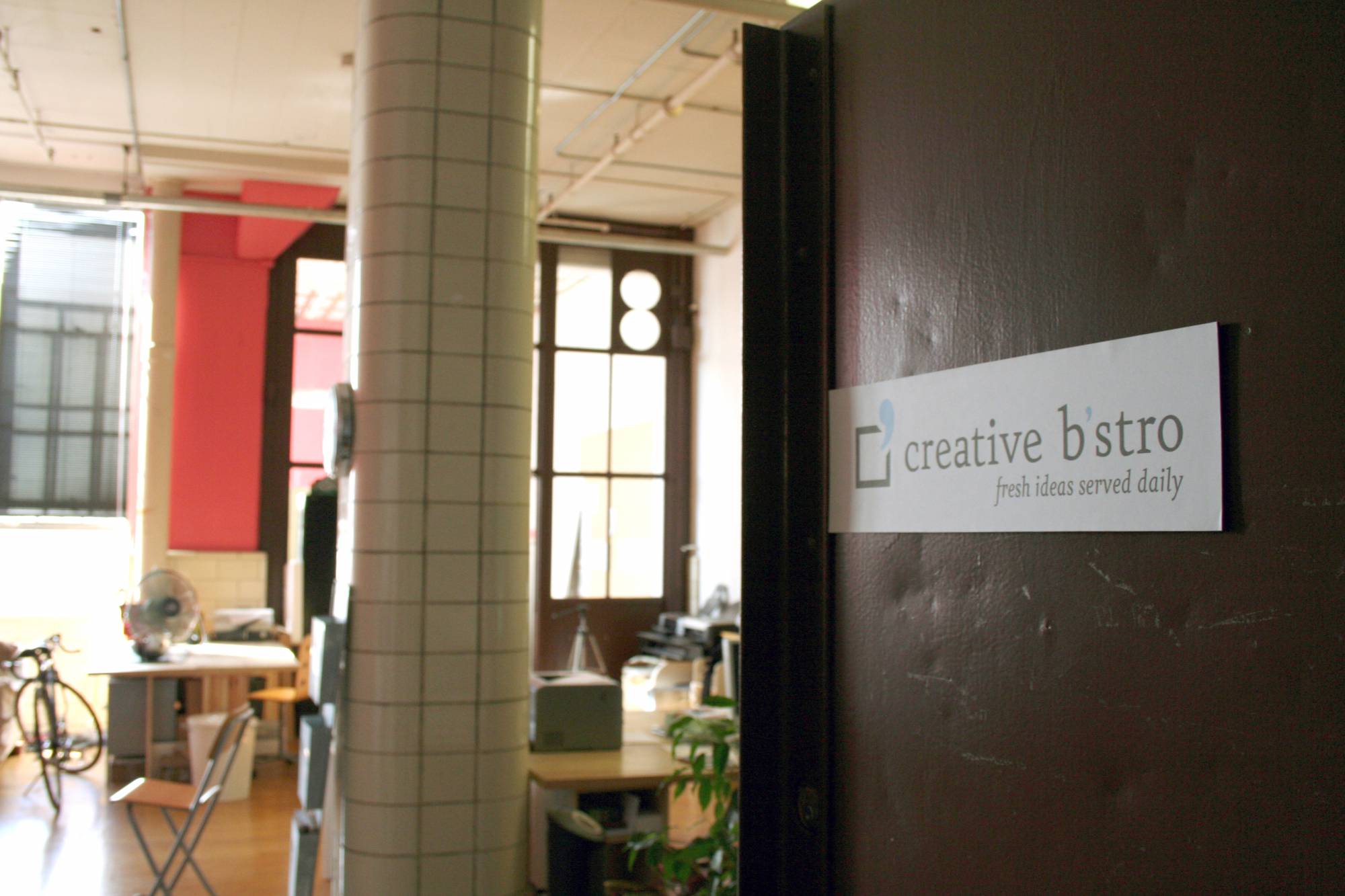
When we opened in 2004, Creative B’stro was a small boutique agency. Actually, we felt it was a stretch even to call ourselves an agency — we were 3, then 5, then 8 designers collaborating around a kitchen table, with Jill handling account service, estimates and copywriting.
We knew we were small, and we played to our strengths as the friendly little neighborhood agency that worked behind the scenes to set our clients up for success. We were fast and nimble. We won big accounts but kept a low profile: soft colors and minimal branding kept our clients’ logos (and their work) in the spotlight. Our clients told our story, and our business grew organically through referrals — which is still how we’re growing today.
These days, we’re still as fast and nimble as ever — but there’s been a shift in energy and skillsets. We’ve built on our reputation of being able to quickly respond to client and market needs by pushing (and sometimes being pushed) to expand our expertise. We’re more seasoned and more confident, and we’ve become leaders in new technology, social campaigns and design innovation. And as Jill points out, our visual identity needed to keep pace:
There was a sense in the office that our logo was no longer reflective of who we had become. We were bigger and stronger, and the work we were doing felt more exciting. Web, social and video — where we live, and where our work stands out most — is dynamic. Our logo had to feel at home in these environments and give us room to play, create and continue to change.
Step One: Making a Plan
We began as we would for any client — by assessing the existing logo’s strengths and deficits, and establishing a set of objectives for a new identity system. One thing was agreed on almost immediately: it was time for the “B’postrophe” to go.
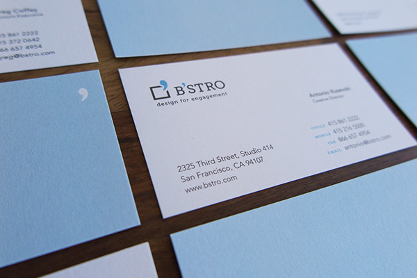
Repeating the apostrophe in the mark and the logotype diluted its impact, and its friendliness had begun to feel a bit precious — too soft, and too small, to reflect our work and our clients. So despite our affection for it, the design team decided the apostrophe should evolve, if not disappear altogether.
Step Two: The Mark
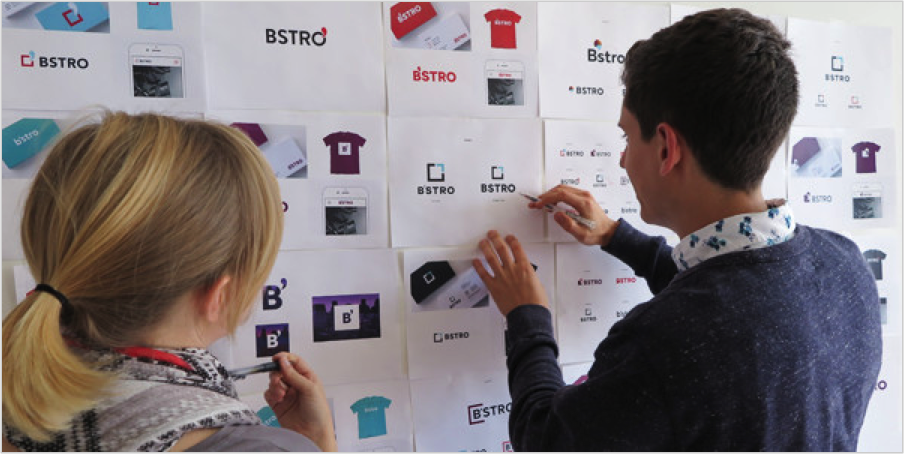
Which left us with a question: what should replace the B’postrophe? We agreed that a new mark should be versatile, offer room to explore extensions and variations, and help set up the logic of the new logo’s supporting visual system.
So we played. We played with the O in B’stro. We played with the B. We played with the box — which, instead of the apostrophe, opened to release illustrations, animations and, in one case, even a one-eyed monster.
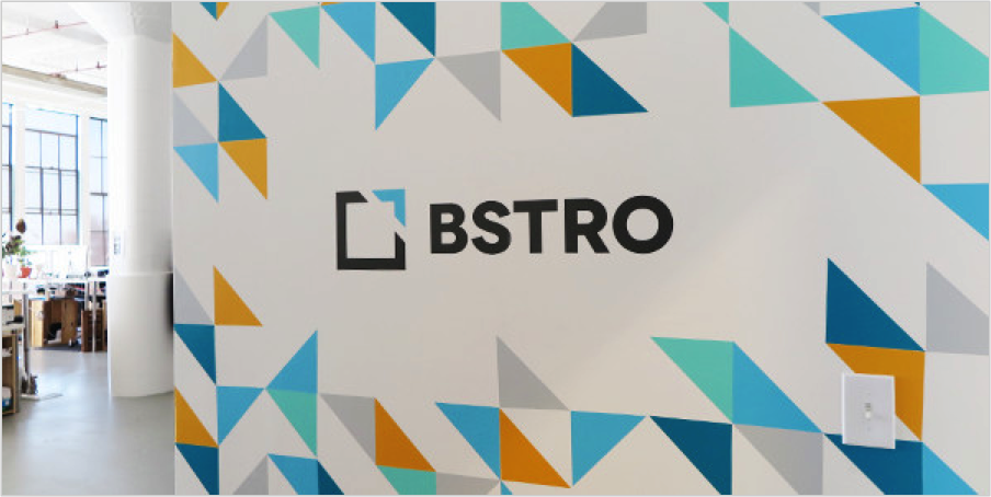
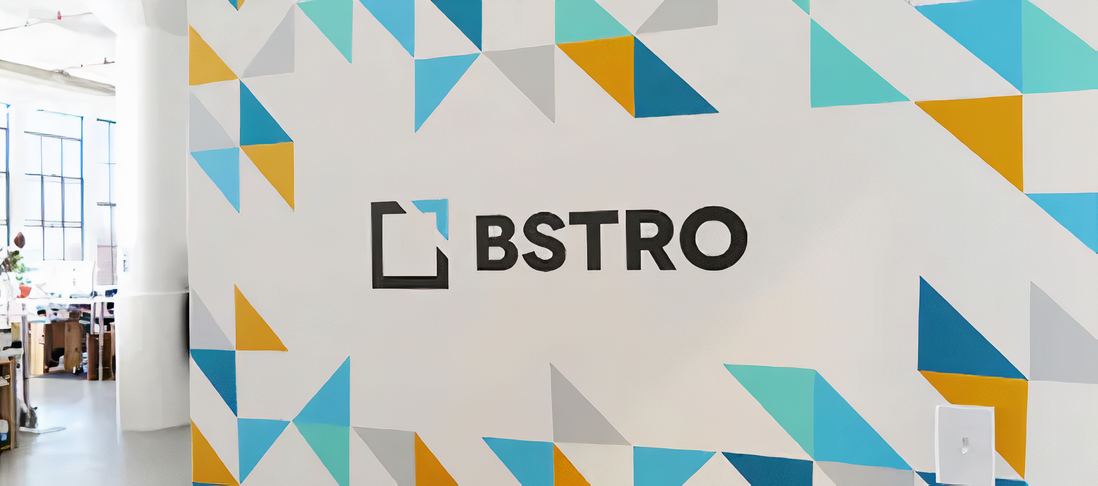
But the design that resonated most was simplicity itself: an open square with a diagonal cut that reinterprets our old friend the apostrophe as an abstract shape. It even passes the “napkin test” — like many iconic brand identities, it’s easily reproduced in a napkin sketch.
Step Three: The Logotype
When your creative team can argue over the nuances of typefaces as if they were global trade agreements, the selection of a logo font is never a simple task. While designing the mark, we also explored a wide variety of typefaces — serifs and sans, semis and slabs, even custom lettering — to capture the personality and tone we wanted to convey.
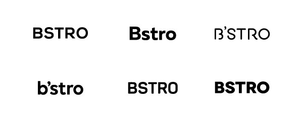
The font study also helped establish a convention for how to spell the new apostrophe-less B’stro. Was “Bstro” odd-looking? Was “bstro” too self-effacing, or confidently understated? Did “BSTRO” look like an acronym?
After some deliberation, we landed on a bold, geometric sans-serif, set in all caps and tightly letterspaced to concentrate its energy and attitude — the perfect complement to our striking new mark.
Clean, vibrant and modern, the new logo feels made for the digital world — and for the future of BSTRO. Or, as Jill puts it:
“The new logo doesn’t feel apologetic. It’s bold, crisp and direct, with nothing extraneous or excessive. The mark is flexible enough to play with colors, backgrounds, patterns and animation while remaining solid and stable. By cutting the word Creative and writing the name in all caps we continue to reinforce this direction.”
Creatives are always the toughest clients to please, but with this latest iteration of our logo, we’ve managed to make even our most vocal internal critics happy. Maybe not for the next ten years, but at least today, our identity is aligned with how we see BSTRO.