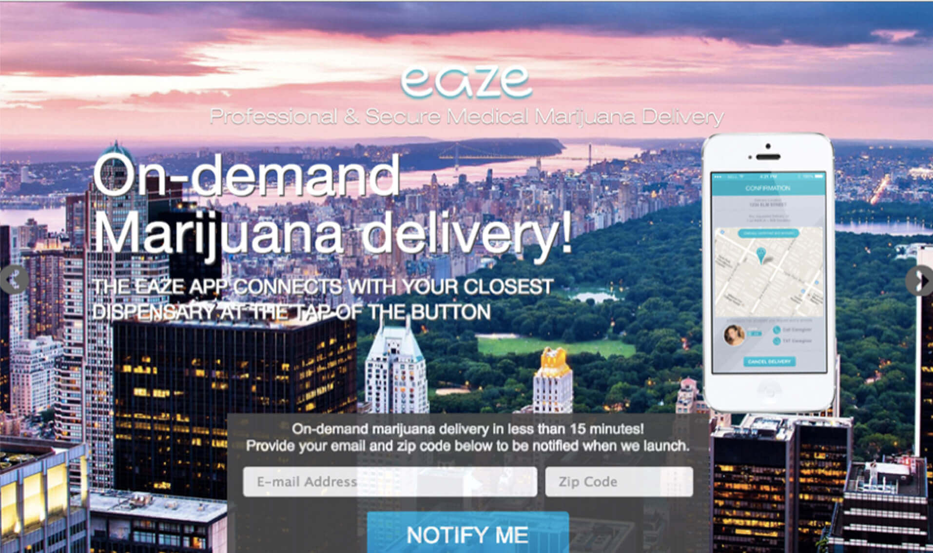
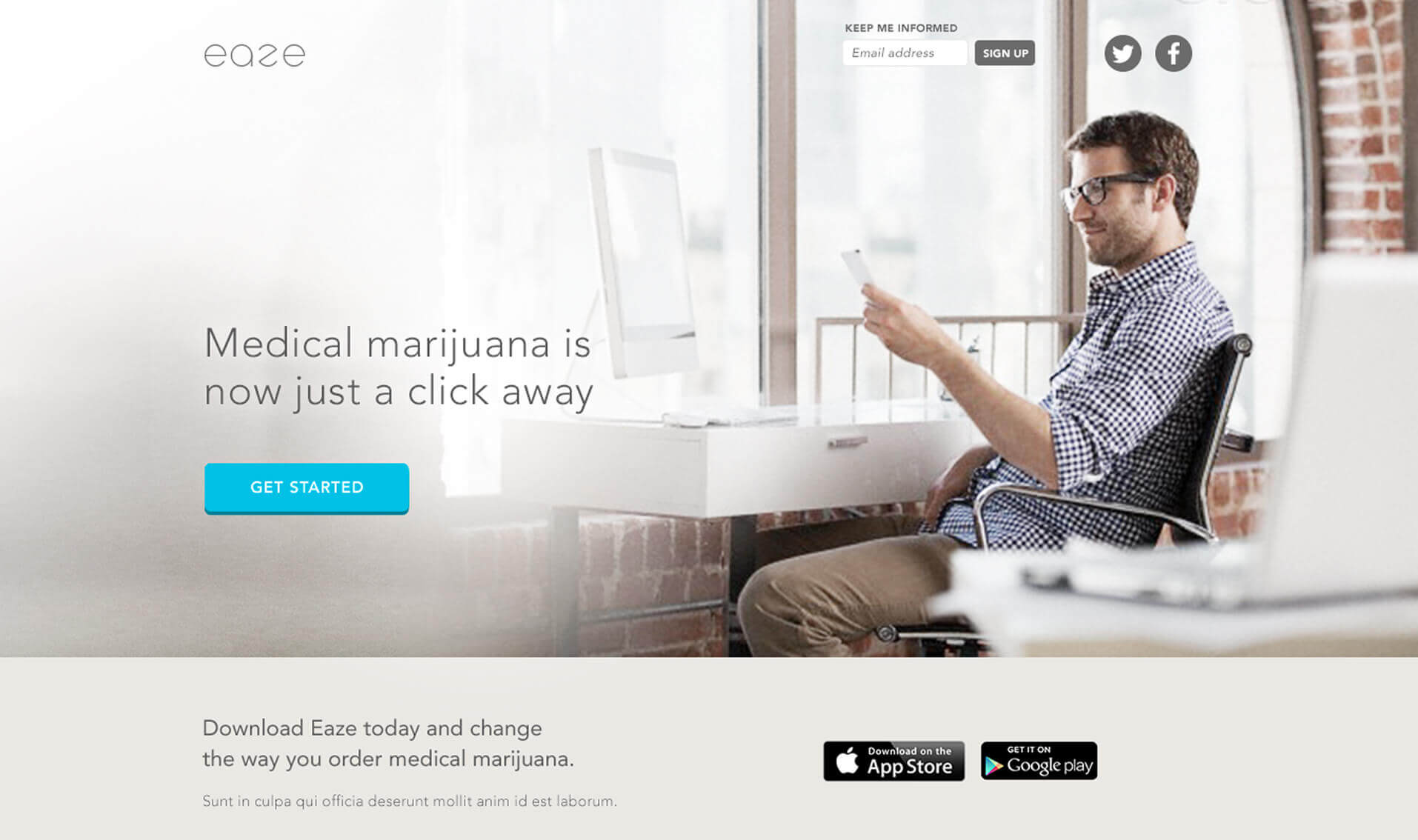
Eaze had big plans for launch: to make cannabis delivery as easy and discreet as ordering takeout. But it was 2014 and cannibis stores were wrought with tired stereotypes and dated design. To stand out, we wanted Eaze to look more Silicon Valley than smoke shop while still feeling fun and approachable. From logo to mobile app to website, BSTRO built a digital-first brand that helped position Eaze as a leader in the legal cannabis space.
Positioned the brand for mainstream adoption Designed with clarity and discretion in mind to appeal to new and emerging cannabis users—professionals, parents, and first-timers alike.
Created a scalable, tech-forward identity A crisp logo and clean aesthetic gave Eaze the polish of a high-growth startup and the confidence of a modern health brand.
Designed the first Eaze app and website Built a frictionless experience for everything from user verification to delivery tracking—removing barriers and building trust.
Launched with digital at the center Prioritized mobile-first design, intuitive navigation, and bold, professional visuals to set the tone for the entire customer experience.
The Result:
Eaze didn’t just launched, it took off with a polished brand and intuitive tech platform that helped change perceptions—and purchasing behavior. The original identity, still in use today, supported rapid growth and major funding milestones as Eaze expanded to become the market leader they set out to be.
$200M+
Raised in funding from 17 top investors
80%
Of California now within delivery range
1
Logo that’s still in use nearly a decade later
What Stands Out:
Eaze needed a brand that could redefine what their industry could look like. We gave them an identity rooted in simplicity, credibility, and ease. It worked then. It’s still working now.
The logo we created in 2014 remains a cornerstone of the brand, helping Eaze attract over $200 million in funding and expand its footprint to cover 80% of California and parts of Michigan with the confidence of a true category leader.
Website
“Wow! I wanted the company to look good; I just didn’t imagine it would be this impressive out of the gate. We’re blown away by the quality of the exploration and the end result. I’m so excited to show our new company to the world!”
Keith McCarty – Founder, Eaze
Ready to Get Started?
Let’s talk about the challenges and opportunities in front of you, and how we can make things easier and more effective.
We use cookies to ensure that we give you the best experience on our website. If you continue to use this site we will assume that you are happy with it.Ok