Take a moment to pause and consider how much of a role the Internet is in your daily life. How many times do you pick up your phone to Google something? How much do you shop online? What services do you use regularly that are only available digitally?
Imagine if you couldn’t access the services and information you needed because the Web wasn’t built with your needs in mind.
The reality is almost three out of 10 Americans and Canadians living with a disability can’t use the Internet in the same way that you do. 1, 2
Web accessibility isn’t just a nice-to-have; it’s a must. With laws now in place outlining accessibility standards, it’s both a social responsibility and a legal requirement.
Creating an accessible website opens up your digital presence to everyone, including those with:
- Vision impairments, who may use screen readers to engage with digital content
- Motor impairments, such as those caused by Parkinson’s disease, cerebral palsy, or multiple sclerosis, who depend on assistive tools to navigate the Web and
- Other challenges, like epilepsy, dyslexia, color blindness, or migraines, who benefit from inclusive UX & UI design and customizable settings.
Let’s make sure no one is left behind in the digital world.
By the end of this article, you’ll have a solid understanding of what it means to have an inclusive and accessible website that caters to a diverse audience.
Why website accessibility makes good business sense
Of course, your business needs to follow local regulations, but ignoring inclusive and accessible content and communications also means you’re missing out on reaching a group of consumers with a collective buying power of $13 trillion globally. 3
Providing accessible content and communications demonstrates a brand’s commitment to inclusivity, and can lead to positive brand perception, tapping into a larger potential customer base, and also helps your site rank higher in search results.
Let’s make sure your site is open to everyone.
What makes Web content accessible?
Accessible Web content removes barriers for people with disabilities, making it easier for them to use and access your site. This means that your website and content is:
- Perceivable: Your content is crafted to be recognized and understood through various senses — sight, sound, and tactile feedback.
- Operable: All controls, buttons, or navigation are easily manageable using assistive technologies like keyboards, screen readers, or voice recognition systems.
- Understandable: Clarity and predictability in content and navigation is prioritized, enhancing the user experience for all.
- Robust: Your site is built to be flexible and supports a wide range of technologies and devices that your audience chooses to use, ensuring no one is excluded.
These are often called the POUR principles.
8 must-know Web accessibility factors you can’t ignore
As a digital agency that’s made who knows how many websites over the past 20 years, we’ve seen some things.
Here’s the eight most common Web accessibility factors you can’t ignore:
1. Text contrast
Imagine navigating a world where colors blend into one another, making it challenging to distinguish details in everything you see. For those with vision impairments like color blindness (which is more common than you may realize), this is a daily reality.

Some colors are difficult to see when placed next to each other. When multiple colors are tightly placed without enough contrast, readability will suffer.
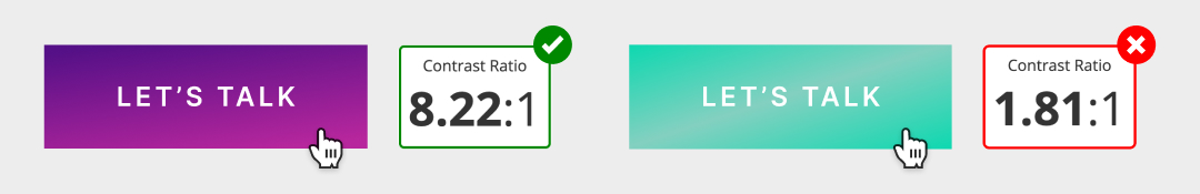
Check your text contrast with the Contrast Checker page from WebAIM, a prominent web accessibility organization. Enter in the colors you’re using and their tool will tell you whether the contrast meets standards.
2. Alt-text
Alt-text is the narrator of the visual Web, stepping in when images can’t be displayed so everyone understands the full story your page is telling. Alt-text should clearly and accurately describe your images. This simple yet crucial text makes sure that all users can experience your content.
Always — ALWAYS — provide alt-text.

Why? Alt-text isn’t just a backup — it’s a key accessibility feature for people who use screen readers. These tools translate text into speech or Braille, but they need words to describe images that they can’t see.
Alt-text also plays a role in SEO, helping your site’s images be indexed correctly and enhancing overall visibility. Finding images that are missing alt-text is easy — website crawlers like Screaming Frog can scour your site for them in a matter of minutes.
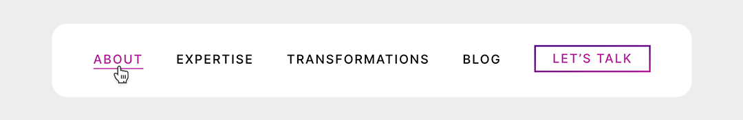
3. User interface (UI) conventions
Just like the familiar stop signs and traffic lights that guide us through our daily lives, user interface conventions help everyone navigate a website with ease.
Elements meant for interaction — such as buttons for submitting forms or links to new pages — should be instantly recognizable.
We know it might be tempting to be creative with design, but it’s crucial to keep common signals clear, like underlining hyperlinks to indicate they are a clickable element. Design that breaks from common UI conventions should be approached with care and with full consideration of what confusion or barriers could be introduced.
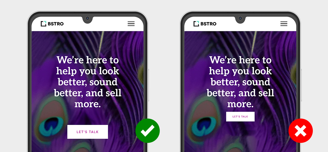
For people with motor or dexterity impairments, the ability to navigate a site with a keyboard is essential. Making sure that interactive elements like buttons are highlighted when selected is a necessity. This visual cue is vital, signaling to users what happens when they press ‘enter’.
Button size and placement should also be considered, especially for smaller mobile devices or tablets. Everyone’s hands are different, not just in size but in dexterity, and design should reflect universal ease of use. Clickable elements that are small or too close together could make it hard for people to navigate your site.
4. Clean code, navigation, and page structure
The backbone of any accessible website is its code. The way your site is coded not only affects its visual appearance and functionality, but also determines how accessible it is.
Screen readers and text browsers run on software that reads the code of your website. These tools rely on clean, well-structured code to interpret and navigate your site effectively.
Unnecessary code elements, like empty links or poorly generated alt-text, can confuse screen readers. To avoid this, run your code through this validator to make sure the markup meets current Web standards.
Having a clean navigational structure isn’t just a feature — it’s a necessity. Intuitive headers, footers, and breadcrumbs, guide your visitors through your site with ease, and should be thoughtfully considered to make sure it enhances the user experience.
Using proper heading structure and organization also improves the readability and usability of your website, breaking up content into logical sections and providing important context for users. Make sure you have a logical hierarchy and use descriptive text that accurately reflects the content of the section.
Yale’s Usability website is a deep resource for accessibility in Web development that should be bookmarked by every developer.
5. Zoom functionality
At BSTRO, we pride ourselves on crafting stunning websites that honor your creative vision. However, it’s crucial that everyone can easily access and interact with your site. This includes making text, images, and interactive elements easily enlargable without losing functionality. If a website doesn’t support easy zooming, it’s not fully accessible.
To check if your site meets these standards, try stepping into your users’ shoes. Visit your website and zoom in to 400%. Is navigation still smooth? Do all interactive features work correctly? Make sure every part of your site is visible and functional at this enlarged view. This hands-on test is the best way to make sure your website is truly user-friendly.
6. Accessible video and animations
Web animations like sliders, pop-ups, and animated text can add style and personality to your website, but it’s important that these elements enhance rather than hinder the user experience. As a best practice, avoid animations that interfere with site navigation. For example, don’t allow pop-ups to obscure your main menu or have links that move erratically across the page. While these features might seem playful, they can frustrate some users.
Providing transcripts or closed captions for audio and video content is essential, allowing equal access to information.
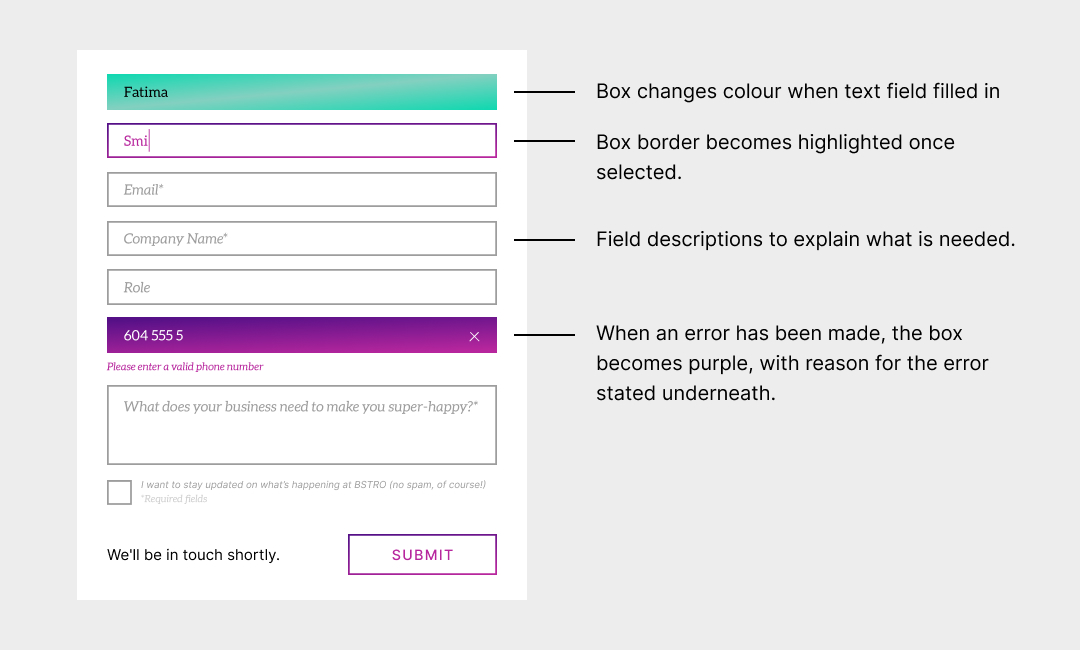
7. Accessible forms and error handling
Contact forms, signup forms, and payment forms are key conversion points on any website — they must work flawlessly.
Each form field should have a clear, concise label that explains what information is needed, free from abbreviations or jargon. Screen readers use these labels to help users understand what to enter.
For users who can’t use a mouse or trackpad, forms should be fully operated with a keyboard. Allow users to use the tab key to navigate through fields and buttons, and allow form submission with the enter or spacebar key.
If there are errors with a form submission, give clear, specific messages that explain what went wrong and how to fix it. For example, instead of just saying “Invalid input,” it’s more helpful to say “Please enter a valid email address.” Avoid using color as the only way to show errors. Not everyone can see colors well, and screen readers don’t pick up on them. Instead, use a combination of color, text messages, and visual cues like bold text or icons to clearly indicate errors.
8. Reading level
Simplifying the language on your website isn’t just about meeting accessibility standards — it’s about creating an inclusive space that welcomes all users.
Complex words can be barriers for people with learning disabilities or varying literacy levels, or those who are non-native English speakers. Avoid jargon and rare words — aim for a grade nine or lower reading level whenever possible.
You can check the readability of any document directly within Microsoft Word or with a Google Chrome extension.
Summing it up
Investing the time and effort into Web accessibility is a powerful statement of empathy and inclusiveness for your audience, but it also makes sure your message reaches more people. Let’s create a digital environment where every interaction with your brand, products, or services is effortless and welcoming.If you want help getting your website up to accessibility standards, reach out and let’s talk.